Researchers need training in data visualization techniques for more effective manuscripts and messages.
iStock, Pavel Kot
Visuals and graphics have never been more important for scientific communication as they are now. One reason is because scientific data is more multifactorial and multiparametric than ever before, as researchers delve beyond one-on-one interactions to study networks and systems.1 The other reason is because scientific manuscripts are expected to be denser and more comprehensive than they were in previous decades. The typical Cell paper now contains six times the number of graphical panels as it did in 1974, when the journal was founded.2 Fortunately, scientists have access to more graphic design options than ever before. Unfortunately, visual presentation—the “grammar of graphics”3—remains an undervalued and overlooked part of scientific training. To effectively present their work, scientists must study and understand the tools at their disposal and select the right vehicle for both the data and the message that they are trying to convey.
Defining Graphs, Tables, Figures, and Diagrams
Before talking about best practices for visually presenting scientific data, it is important to summarize and define what tools are available. For most fields, graphs are the most common form of visual presentation for data. Graphs exist in numerous shapes and formats, but as a rule, should only be used to present trends or relationships between the examined variables.4 Graphs should not be used if presenting data for reference purposes.
Tables are the most popular alternative to graphs. They can showcase large amounts of precise data that would clutter a graph or be too cumbersome to summarize through text alone. Tables are useful for providing systematic overviews and providing background information. They are best used when data should be given equal attention, rather than when presenting data trends or relationships. A good table should not overwhelm the reader, either by being too large or by providing too much information.5
In contrast to graphs and tables, which are mainly used to communicate data, diagrams are largely used to visually explain concepts, including mechanisms, networks, and protocols.5 Diagrams can include flowcharts, schematics, illustrations, and other ways of highlighting complex relationships. Data presentation is not a primary purpose for diagrams. However, data can be used in limited amounts to reinforce a relationship or interaction that is pivotal to the overall concept.5
Finally, while readers may sometimes use “figure” to mean “graph” or “diagram,” authors and designers should avoid that trap. A figure is a graphical presentation created and designed to visually convey a concept, claim, or argument.5 The vast majority of figures in modern scientific manuscripts comprise more than one element, and can include a combination of graphs, diagrams, photographs, and other visualization types.2 For the most part, figures do not contain tables. A well-created table overshadows the other elements in the figure, while labels might be better option than smaller tables.
Choosing Between Different Graph Types
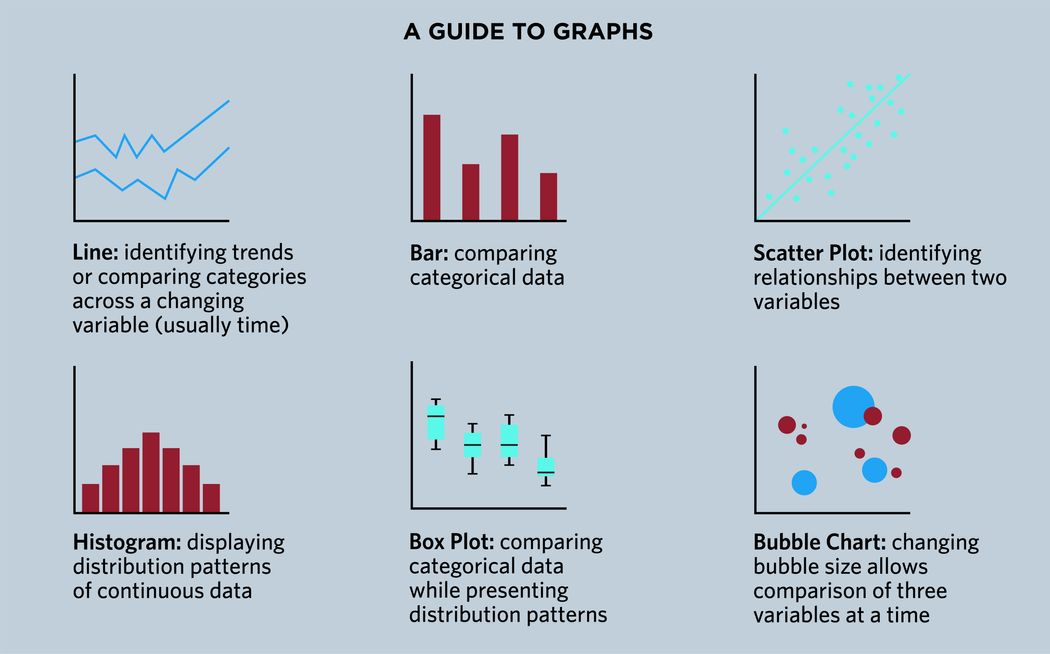
A quick glance at any data visualization platform shows that there are dozens of different graph types, from “classics” such as line graphs and bar graphs to more esoteric options such as radar charts and bubble charts. Scientists can be tempted to think that these differences are purely cosmetic, but different graph types are not interchangeable, and each has been developed because they are optimal for communicating a specific sort of relationship or message. The right graph for a given situation depends on what—and how much—a researcher is trying to convey.

Different graph types are best used to showcase different datasets and relationships.
The Scientist Staff
Line and bar graphs are the two most used types of graphs by scientists.6 However, they are often employed incorrectly. A 2020 study examining roughly 230,000 papers across a range of fields found more incorrect usages of bar graphs than correct ones.7 Line graphs present trends across a changing variable, such as the passage of time or changing temperatures. Conversely, bar graphs compare discrete values across multiple groups but in response to a single variable value, such as a distinct time point or in response to a specific treatment.4,5 Line graphs are not ideal for comparing discrete values across multiple groups, while bar graphs should not be used to examine changing trends over more than two variable points.5
An example of a classic experiment that should presented using a line graph is the murine intraperitoneal glucose tolerance test, which measures changes in blood glucose at different timepoints. However, if an author wants to display the maximal blood glucose value regardless of the timepoint at which it occurred, they should use a bar graph. In this way, using both a line graph and a bar graph as separate panels within a figure can be a good way to emphasize a particular finding within a greater trend.
Both bar and line graphs share a weakness in that they display only the mean values commonly employed to summarize datasets, rather than the dataset values themselves.6 For example, using a bar graph to show paired data (i.e. before and after treatment) does not present how individual pairs behaved.6 Here, scientists should consider alternative data visualization formats, such as scatter plots, box plots, and histograms—all of which provide the audience with information on data point distribution and variability in addition to the mean value.6,7
That said, implementing these formats is not as simple as just exchanging bar graphs for dot plots. Each individual data point within a 100-plus point dataset, for example, cannot be shown without sacrificing legibility. Not only should scientists be encouraged to offer a more comprehensive presentation of their data, but also undergo formal training in how to best accomplish this.6,7
Using Different Data Visualization Formats Together in a Multi-panel Figure
The best thing for scientists to remember is that multiple visualization formats can be used together to tell a more comprehensive story. Hypothetically, suppose one experimental group displayed a single large-peak response and another experimental group showed a response composed of two smaller peaks. Here, the authors could use a bar graph to compare peak magnitudes, a line graph to examine peak timings, and a scatter plot to present distribution profiles. These three visualization methods would work together to give the audience a better picture of how consistently the monophasic and biphasic responses were observed, as well as the variation in peak magnitude.
Planning for these situations can be daunting. How should scientists divide up their data? Which visualization methods should they use? How many panels is too many? The answers to these questions largely depend on what the authors are trying to communicate, and what their primary message is. For example, in a manuscript examining a putative novel cell signaling pathway, the first panel could focus on first messengers and then move on to second messengers, agonist/antagonist experiments, and ultimate downstream effects. To find the stopping point, the scientist should identify when additional information is no longer necessary to establish, confirm, or validate the information already presented.
Finally, researchers should keep scope and depth in mind when assembling multi-panel figures. The ability to present information at different scopes is a great advantage, but this needs to be used with care. For example, when working with microscopy images, a high-magnification inset panel showing individual cells can be very helpful for showcasing morphology, co-localization, or spatial proximity. However, these panels are not helpful if the original low-magnification image does not actually have enough resolution to clearly delineate and distinguish these cells, nor are they helpful if the purpose of the low-magnification image is to emphasize spatial distribution within a tissue section. Similarly, a bar graph comparing magnitude is useful when a line graph displays one or two peaks, but it is not as helpful when the longitudinal trend has three, four, or more phases—or when it lacks a clear peak.
A Picture Must Be Worth a Thousand Words
Researchers are delving deeper than ever before into the mechanisms that underlie biological health and disease, powered by new technologies that yield data at unprecedented resolutions and throughputs. As scientists work with more complex datasets, their findings likewise grow more layered, nuanced, and comprehensive. Accordingly, the vehicles and methods that they used to present these relationships and interactions also become more sophisticated. In today’s research environment, visualizations can no longer be an afterthought. They exist not just to give emphasis to the text, but they are key to taking the audiences to places that words cannot—toward communicating patterns, networks, and systems for which words are insufficient.
Looking for more information on scientific writing? Check out The Scientist’s TS SciComm section. Looking for some help putting together a manuscript, a figure, a poster, or anything else? The Scientist’s Scientific Services may have the professional help that you need.
- Lunn AJ, et al. The evolution of scientific visualisations: A case study approach to big data for varied audiences. In: Shapiro L, Rea PM. (eds) Biomedical Visualisation. Advances in Experimental Medicine and Biology, vol 1388. Springer, Cham. 2022.
- Ariga K, Tashiro M. Change in the graphics of journal articles in the life sciences field: analysis of figures and tables in the journal "Cell". Hist Philos Life Sci. 2022;44(3):33.
- Wilkinson, L. The Grammar of Graphics. Springer, New York. 2005.
- Slutsky DJ. The effective use of graphs. J Wrist Surg. 2014;3(2):67-68.
- Divecha CA, et al. Utilizing tables, figures, charts and graphs to enhance the readability of a research paper. J Postgrad Med. 2023;69(3):125-131.
- Weissgerber TL, et al. Beyond bar and line graphs: time for a new data presentation paradigm. PLoS Biol. 2015;13(4):e1002128.
- Riedel N, et al. Replacing bar graphs of continuous data with more informative graphics: are we making progress? Clin Sci (Lond). 2022;136(15):1139-1156.


